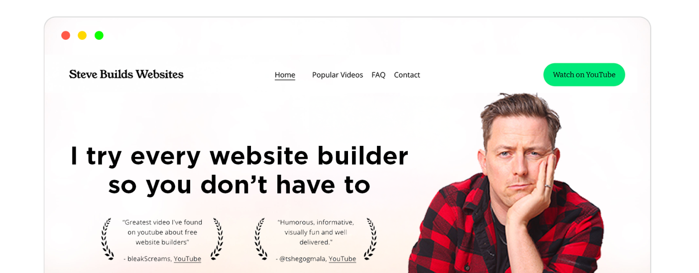
Best Website Builder
I test every website builder so you don’t have to. These are my rankings of the best website builders for 2026.
Our work is supported by affiliate commissions. Learn More
Last Updated May 27 2026
Every part of a great restaurant website should communicate what the brand and dining experience are all about.
Mouthwatering food shots are important, but so are color schemes and font choices—bright colors might be appropriate for a juice bar, while dark colors might be the right look for your steakhouse.
And, of course, don’t forget why online visitors come to the website in the first place. They want to see the menu, find directions, order online, or reserve a table, among other things. Make it easy for them to achieve these goals with your restaurant website design.
Read my tutorial on Creating Excellent Restaurant Websites for more info!
Tip: Use ← and → arrow keys to browse.
Cutler & Co. has a sleek, minimalist website that highlights the restaurant’s upscale atmosphere.
The photos stand out the most: The hero photo is a well-composed shot of wine, tables, and diners in the background; further down the page, you’ll see superb food photography and a photo of people enjoying their time there. Overall, it creates a calm, premium mood and gives visitors a good idea of what to expect. It’s a great example of the “show, don’t tell” principle.
All the information you’d need is right there on the hero section. Location? There. Opening hours? There. Contact details? There. Actions you’d likely want to perform, like seeing the menu or making a reservation? The CTAs right there!
Overall, it’s a great restaurant website to draw inspiration from for both aesthetics and functionality.
La Semilla is a modern plant‑based Latin restaurant that celebrates classic Latin dishes reimagined with vegan ingredients and creative cocktails.
It has a playful, design-forward website that stands out from typical restaurant layouts. The earthy palette, quirky typography, and strong visual identity make it feel creative and current. The booking and menu navigation remain clear. Similarly, hours, contact details, location, etc., are available on a scroll at the almost-obvious place.
I also like the way they present the menu as a gallery of images right on the homepage:
I’d still prefer an HTML-based menu, which would be better for SEO, responsiveness, and accessibility, but this is a simple yet clever idea that is slightly better than asking visitors to download a PDF.
Fiola by acclaimed chef Fabio Trabocchi is a Michelin-starred restaurant that pairs culinary excellence with farm-fresh ingredients.
Fiola’s website feels elegant in a restrained way. The soft color palette, refined typography, generous spacing, and polished food imagery support the fine-dining positioning. This site feels expensive without trying hard!
Ma‘ono is a casual Hawaiian-style fried chicken restaurant known for crispy sandwiches, picnic chicken, and a fun, upbeat island-inspired vibe.
Ma‘ono’s website is bold, fun, and instantly memorable. The bright yellow header, oversized black logo, and huge fried chicken hero image make the brand feel loud, confident, and full of personality right away.
The design keeps things simple with clear navigation, a prominent “Order Online” button, and easy-to-scan location cards.
Food photography does most of the work, while the repeated “Crispy, Juicy, Aloha” message is especially effective: “crispy” and “juicy” make the food feel craveable right away, and “aloha” quickly gives the site a warm Hawaiian personality without relying on long, clichéd descriptions.
I also love the About page with “The Legend of Ma‘ono” story of Chef Mark Fuller.
Located on King Street in New York City, the King Restaurant features a casual vibe and an ever-changing menu that reflects the flavors of Italy and France.
The King website immediately communicates an upscale, chic, and urban dining experience.
At the top, you see an auto-changing slideshow of images that reflects the restaurant’s vibe: an interior shot showcasing a well-lit, spacious bar area, suggesting a modern and comfortable ambiance; an exterior shot showing the corner place and the kind of people that visit them; a clean, well-plated food photo that communicates what to expect.
The tiny fonts, generous whitespace, and clean photos sprinkled throughout the site enhance the restaurant’s brand identity.
On the functional side, the website is easy to navigate, with clear sections for menus, reservations, shops, and celebrations. Important information, such as location and hours, is marked.
A great restaurant website is all about the photography — and I love the eye-catching splash photo on this homepage. It’s inviting and calm. Bull & Last includes everything you might need on a modern restaurant website: online ordering, drink menu, lunch menu, dinner menu and a clear reservations call to action.
Aquarius Restaurant is a high-end seafood and grill venue situated on the picturesque banks of the Georges River.
The website uses dark, dramatic food photography and warm gold accents to create a polished seafood house feel. The oysters-on-ice hero image does a lot of the work, making the site feel upscale and inviting while keeping bookings and menu links easy to find.
Fat Cow is a high-end Japanese restaurant known for authentic washoku and top-quality wagyu. Head Chef Shingo Iijima specializes in Omakase Kappo-style dining, bringing years of experience to every dish.
Fat Cow’s website gives off a premium vibe right away. The dark colors, simple navigation, and close-up shots of Wagyu all work together to match the restaurant’s upscale steakhouse feel.
On the functional side, the location and other details could have been placed in a more convenient spot for visitors rather than on the Contact page. The otherwise minimal text does the place’s brand a favor.
This restaurant is framed as the creation of the “rebellious daughter” of a traditional meat butcher. Instead of following in the family’s meat-centric footsteps, she is paving a new path focused entirely on vegetables and plant-based eating.
The bright, polished website instantly matches its plant-forward brand. Strong, well-lit photos, clean calls to action, and a relaxed editorial layout make the whole site feel fresh, modern, and very easy to trust.
I don’t like that there’s too much going on in the navigation bar. I am sure things can be cut down to the essentials or clubbed together. For example, there’s a “Menu” option that shows all the pages on the website, and a “Menus” option that links to the restaurant menus—that’s very confusing!
Meals by Genet is a go-to spot in LA’s Little Ethiopia if you want classic Ethiopian food packed with flavor.
The website feels warm and welcoming, with real photos and a simple layout. Genet’s personal touch comes through in the images, and the clean design keeps the focus on the food experience.
At the bottom of the page, there’s a clear ‘Ready to order?’ prompt that makes it easy to get started. It helps you find what you need without any hassle.
Loro is a popular Asian steakhouse in Austin known for, as they put it, “Smoked meats, boozy slushees, rad veggies, and chill vibes.” They also have two locations in Dallas, one in Houston, and another Houston location coming soon.
The combination of visual appeal, user-friendly design, clear and concise information, and customer testimonials makes the website effective in conveying the restaurant’s brand and offerings.
No doubt, this is a professionally done website by top-notch web designers & developers.
The Rare Bird Rooftop Bar currently has two locations, one in Nashville and the other in Denver. Both boast a trendy atmosphere with beautiful scenery and delicious menu.
The restaurant has a modern, upscale design with a chic rooftop bar. High-quality images of drinks and food create visual appeal, and warm colors create a cozy atmosphere. Visitors can easily find locations, contact information, hours, and the menu.
Streetbird is a vibrant and fun establishment focusing on flavorful chicken dishes. The Ethiopian-Swedish, James Beard Award-winning Chef Marcus Samuelsson is the face of this establishment. The website excellently showcases him alongside food wherever it can, including the hero section.
Besides, the site has a bold and lively design, utilizing strong contrasting colors and playful graphics. The emphasis is on creating a strong brand identity, reflected in the merchandise and energetic visuals.
Steelbird has many locations, and you can visit the website of each from the links in the ‘locations’ section of this website. Similarly, the Marcus Samuelsson Group has many restaurants, and all websites’ footers link to all other establishments, which is good for both discovery and SEO.
Bandits is a restaurant and bar located in New York. It prides itself on cold beer and popular cocktails complete with traditional bar food.
Sawmill Brewery’s Smoko Room serves locally sourced dishes and has indoor dining reservations, group event bookings, and special offerings like “The Happiest of Hours” and “BYO Wine Monday” to enhance visitor experience.
This is a mature, sophisticated restaurant website with rich interiors. It has amazing images and a calming dark color scheme. It includes contact info, let’s you order online and purchase gift cards. This is one of the best restaurant websites on this list!
As you see on the home page of the website, Fat Choy is located in New York and mixes Chinese and Vegan flavors. They offer dine in, carry out and outdoor dining options for their customer base.
Atelier Crenn is a prestigious, three-Michelin-starred restaurant led by Chef Dominique Crenn.
For good reasons, it has one of the most visually striking restaurant websites. The full-screen imagery, minimal navigation, and artful presentation make the site feel more like an immersive gallery than a restaurant homepage, which fits its poetic fine-dining identity perfectly.
However, I was unable to easily find essential info, such as the location. Maybe that’s on purpose, maybe not, but that’s annoying for a random visitor who lands on the site.
Farmacy is a design example of how to communicate a restaurant’s story. They make it clear that this is a farm to table restaurant with bright imagery and photography that spans the farm to the dining room.
This catches the visitor’s attention right off the bat with a beautiful piece of steak — important for a steakhouse. This website includes an online ordering system and is a pretty solid restaurant website design.
Blue Dog’s website is quite obvious (obvious = user-friendly). The homepage gives three options: Eat, Drink, and Visit. ‘Eat’ will show the food menu, ‘Drink’ opens the drinks menu page, and ‘Visit’ gets you to the directions & timings page. The on-hover background image change also helps with the obviousness.
The obviousness is worth having for any website, including your restaurant website, but it’s the gallery page of Blue Dog that’s the most inspirational. It has well-shot images showcased in a big, two-column layout—something you might want to consider for your site:
Dhamaka is all about bold, flavorful Indian food. The menu covers a wide range of authentic dishes from across India.
The restaurant is so popular that you need to book your table several days ahead, especially if you want to try certain specialty dishes. That’s why the Resy “Book Now” button stands out on the website.
The website uses a bold red color scheme that matches the restaurant’s style. You see their dishes right away, followed by easy-to-find menus for brunch, dinner, drinks, and desserts. There’s also a section showing off awards from top publications, including being named #1 Restaurant of 2021 by The New York Times.
Overall, the website is a single page that works well and gives you all the information you need.
Yang’s Place is a family-run restaurant that serves classic Chinese dishes.
It has a playful, design-forward website that stands out right away. The illustrated noodles, herbs, chopsticks, and hand-painted branding make the restaurant feel full of character.
Mighty Fine is a vibrant burger joint that prides itself on offering top-notch burgers, sandwiches, and shakes. Their ethos revolves around the distinction between merely good and genuinely “mighty fine” food.
The design leans hard into classic burger-joint energy, and it works. The bold red header, retro typography, and oversized burger photography give the site a fun, confident feel, while the messaging around quality and made-to-order food keeps the brand promise very clear.
Neptune’s Taphouse & Eatery is a go-to spot for surf-and-turf dishes. It’s a solid pick for anything from a quick lunch to a special dinner.
Neptune’s website is casual and easy to use, with a coastal look. The seahorse logo, wavy graphics, and sushi photos give it a fun vibe, and it’s easy to find the menu, place an order, or join the waitlist.
Tea at the Empress offers patrons the elegance of the world-renowned Fairmont Empress tea ritual, cherished since 1908.
Their website feels refined, traditional, and very polished. Soft pink accents, elegant typography, and a heritage-driven layout help the site capture the grandeur of classic afternoon tea without feeling overly heavy or old-fashioned.
Luna Grill is a Mediterranean kitchen providing families with fresh, nutritious, and responsibly sourced meals
The restaurant’s site is bright, energetic, and built around food benefits as much as it is on appetite appeal. Big ingredient photography, bold nutrition callouts, and frequent order prompts make the whole experience feel modern, health-conscious, and highly conversion-focused.
Sarma is a lively restaurant and bar, mirroring Turkey’s traditional meyhanes with a menu of shareable small plates (meze), paired well with their array of drinks. While rooted in Mediterranean flavors, Chef Cassie adds a unique twist based on her diverse culinary encounters, aiming for a blend of the familiar and novel in their offerings.
A slideshow of full-screen photos in the hero section beautifully showcases the vibe, culture, and food of Sarma. The navigation menu options are also on-brand.
Moreover, the website has an excellent ‘Our Team’ section, showcasing their experienced chefs. Plus, the usual - reservation feature, gift cards, location/address, contact information, and obviously their menu…
…though, this website shows the menu a bit differently than most. You have to toggle the menu open—which has both upside (space saving) and downside (could be a bit confusing):
Culture Espresso owns two locations in New York City (both loved by the people of New York). They serve inventive coffee drinks and fresh cookies & pastries.
This café website nails the vibe quotient a coffee shop website demands. It does so by showcasing natural pictures of their coffee, the people making it, and the people enjoying it with friends. The beige background color just adds to it.
A good impression is important and Raku creates a perfect first impression with their opening photo — it’s clear this is a high-end sushi restaurant.
Landini Brothers serves classic Italian dishes in a setting that feels straight out of the old world.
The website is clean and easy to use, with photos of the restaurant and its food. You get a good sense of both the history and what’s on the menu now. It’s simple to find more about the restaurant or book a table.
Wild Ginger is an upscale spot in the city center, offering Asian-inspired dishes in a relaxed, welcoming setting.
The website is clean and easy to use. Big photos and clear headlines make it simple to see what Wild Ginger is about, without adding any clutter.
Yang’s Kitchen is a modern and chic eatery offering a relaxed environment with fresh food. The website’s design is light, airy, and welcoming. The use of clear photographs of the interior and dishes suggests transparency and a focus on freshness.
REIGN is a Toronto spot that focuses on Canadian food. If you want a big menu with plenty of gourmet dishes and wines, it’s a reliable choice.
REIGN’s website is clean and welcoming. The green and gold colors, sharp photos, and simple section titles give it the feel of a high-end hotel restaurant.
Alinea Restaurant has a simple web design with a ‘Book Table’ CTA front and center, which is good. But the reason this website is in the “inspiring restaurant websites” collection is its food photography—it’s, simply put, a superb gallery; I don’t even mind the absence of gutters between image blocks.
This Parisian spot stands out for its brunch menu with a Bali-inspired twist.
The website features a stylish design in soft pastel colors. Bright, appealing food photos catch your eye and encourage you to check out the menu. The site is easy to use, with clear sections that make it simple to find what you need.
High Street Deli has a nostalgic, local sandwich-shop feel that comes through clearly on the website. The oversized sandwich imagery, vintage-style logo, and slightly busy layout all add to the sense that this is a long-running neighborhood favorite with a lot of personality.
The Magic Slab makes fresh ice cream every day. If you want classic flavors and a bit of nostalgia, this is a great spot.
The professionally-designed website speaks for itself.